oollee
Before we start
Service of a delay-free supply of pure water full with minerals and oxygen right into your house.
More than just a provider
task
To present a service new for the market, and to tell people about the quality of water and benefits of the service.
Idea
3D aquaman that reminds of how much water is important for a human. Elaboration of the matching details and a step-by-step explanation of the new type of service.
Logo
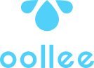
Apart from the website, we’ve designed the logo as well. «Oollee» sounds like улей [ulej], «hive» in Russian. So, the symbol of the company was formed from three water drops resembling a bee. You can see it become a preloader when you open the site, and see it go up the screen when the site’s fully loaded.
The prototype of the 3D water model and of its every pose and movement, is an actual human.

Content
We didn’t merely fill the site with texts explaining the philosophy of water intake, but also made those texts visually attractive: the buttons got a ripple effect, and water is running over the letters — that completes the image and immerges into the atmosphere.

To increase the impression on mobile, we involved the gyro sensor and added vibro response.


Technologies
We focused on the animations: every button and every cursor movement, transitions, hovers and drags — everything works towards the brand’s image. For the site’s reliable work we’ve used PixiJS, WebGL и GSAP.


Gentle melody, sound of rain and waterfall — all enhances the impression and aids the engagement.
Client says

next project
Leviev Group


