Lincor
Before we start
Lincor is a watch brand.
It’s more than just accessories
task
To design a mono-brand image-building eCommerce platform. To show the combination of the product’s quality and affordability and to help the brand in expanding into both online and international markets.
Idea
To bring the product center stage by keeping the design clear in nude tones, showcasing the items in big preview cards, providing direct links between collections and the corresponding models. To keep the overall presentation quality on a high level, we have conducted artistic direction and production of the whole process of photo content preparation.
Users
Offline purchase statistics show that the product’s audience consists of 60% men and 40% women, while online it changes and is mostly composed of women who buy watches for themselves or as a gift. The perception of the product is closely related to the aesthetics of the surrounding space, and the choice, in this case, is more emotion-dependent. With that in mind, we have picked a calm color scheme of peachy tones to complement the design of the watches.
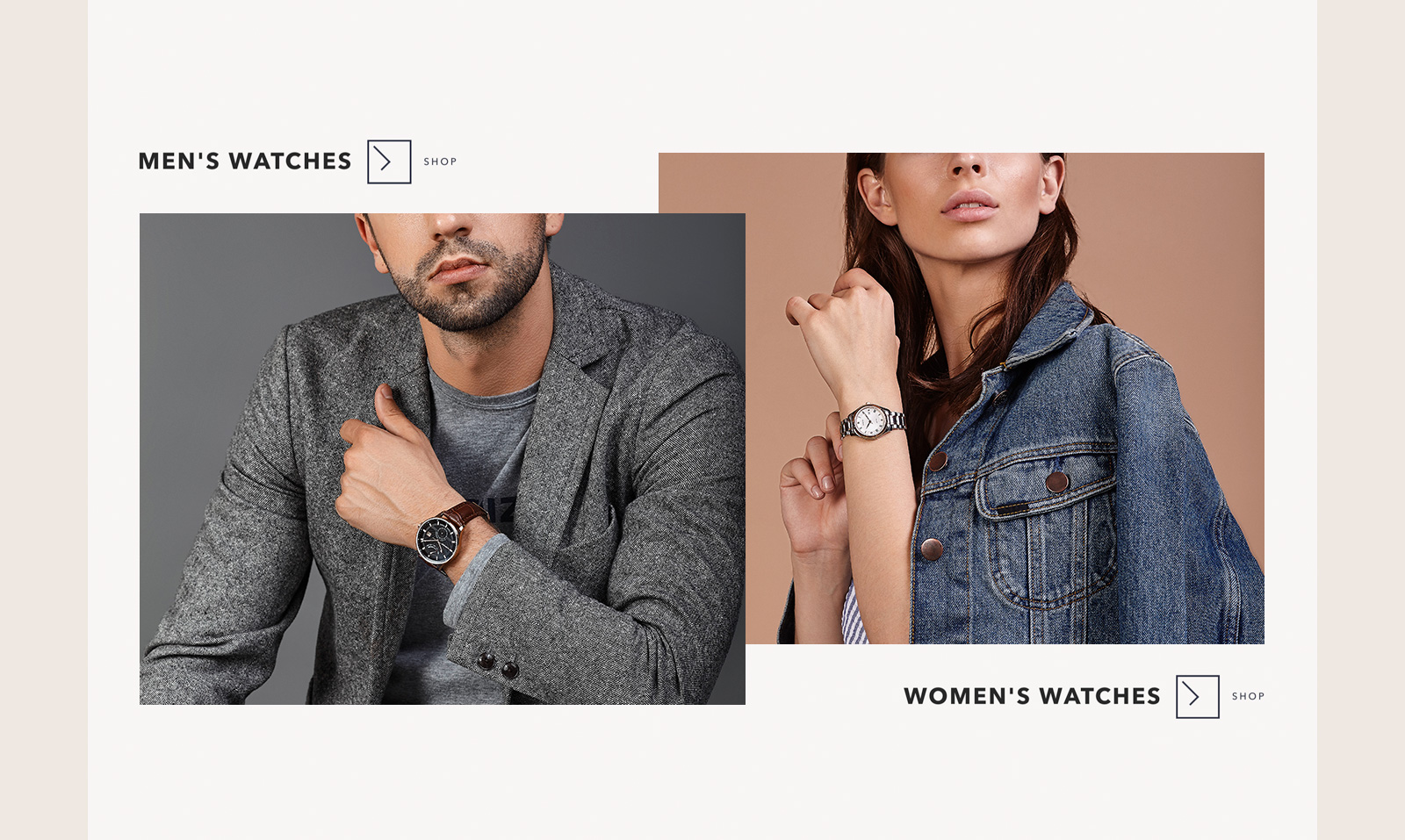
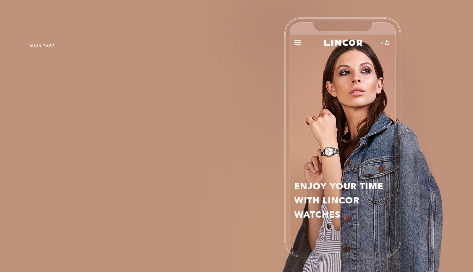
Main page
it is essential for a store to give an impressive presentation of its goods straight from the home page. The emphasis here has been put on the flagship items: we’ve repeated the block distributing to the women’s and men’s catalogs, added a slider to feature the selected items, the most popular ones, the new ones or the items that need to be put in the spotlight — these can be chosen through the CMS.
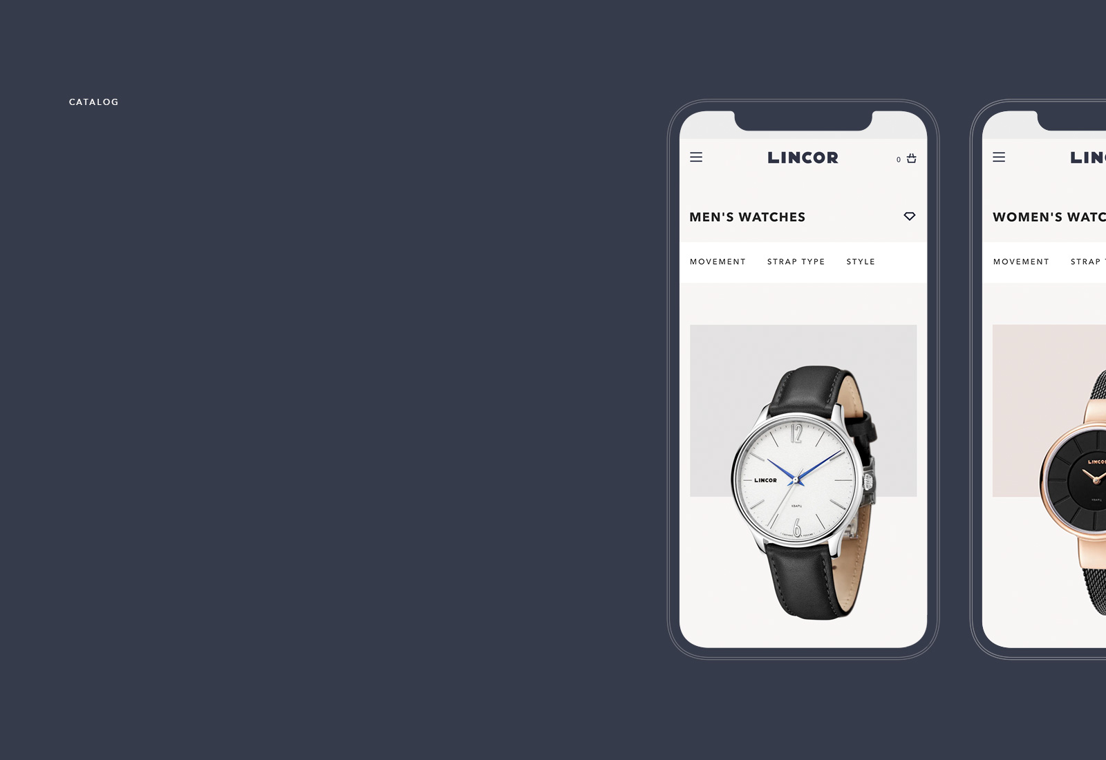
Website for any watch
Lincor produces watches of a considerable number of styles: classic, glamour, sports, minimalistic. We started from the objectives of the business and developed a design that unites all of the mixed collections into a casual, day-to-day style for the target audience.
Promoting the value of the product
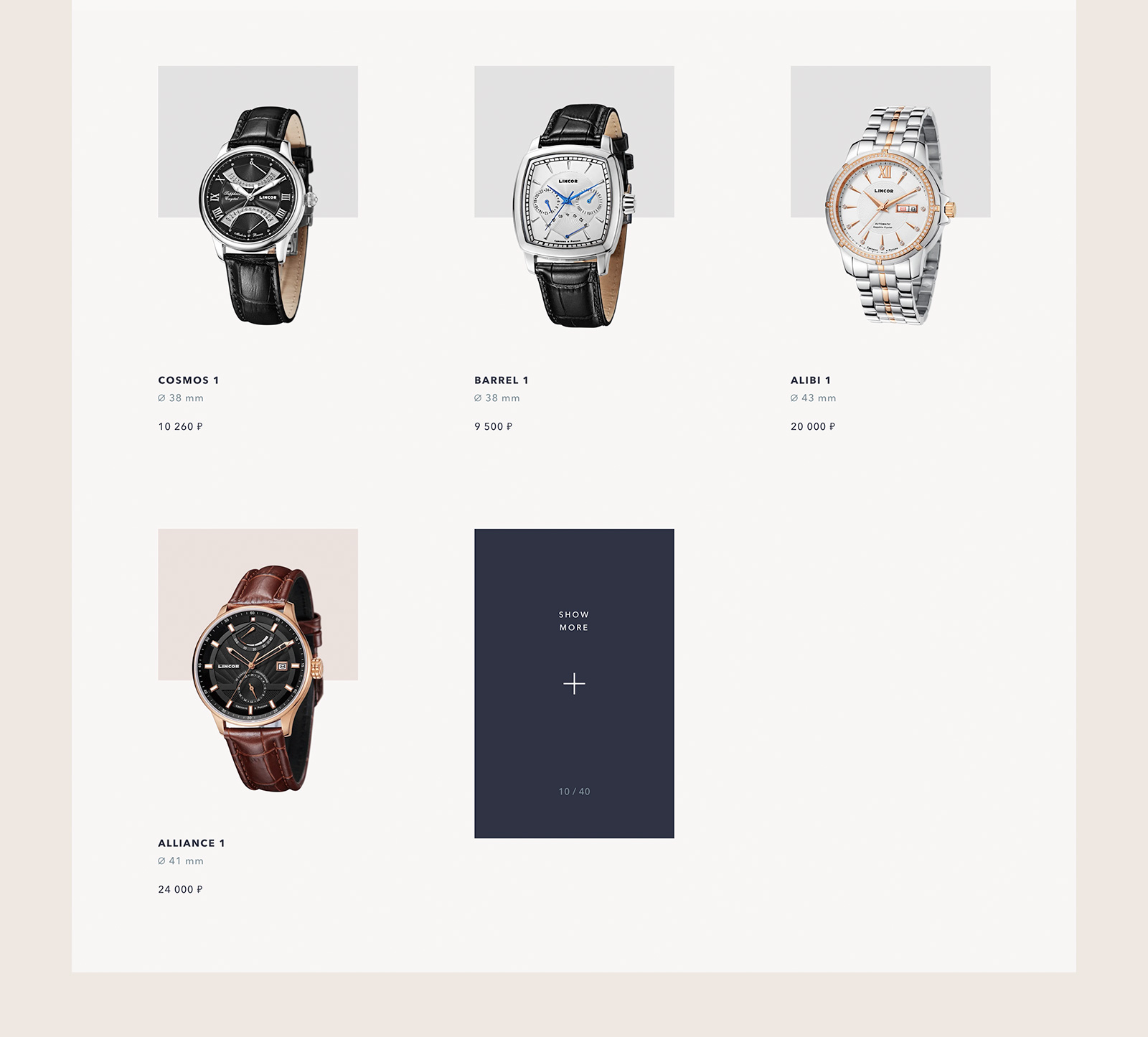
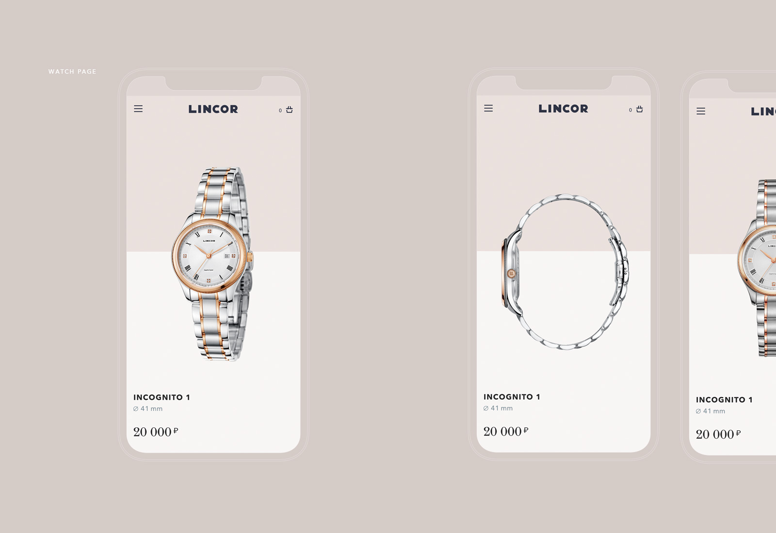
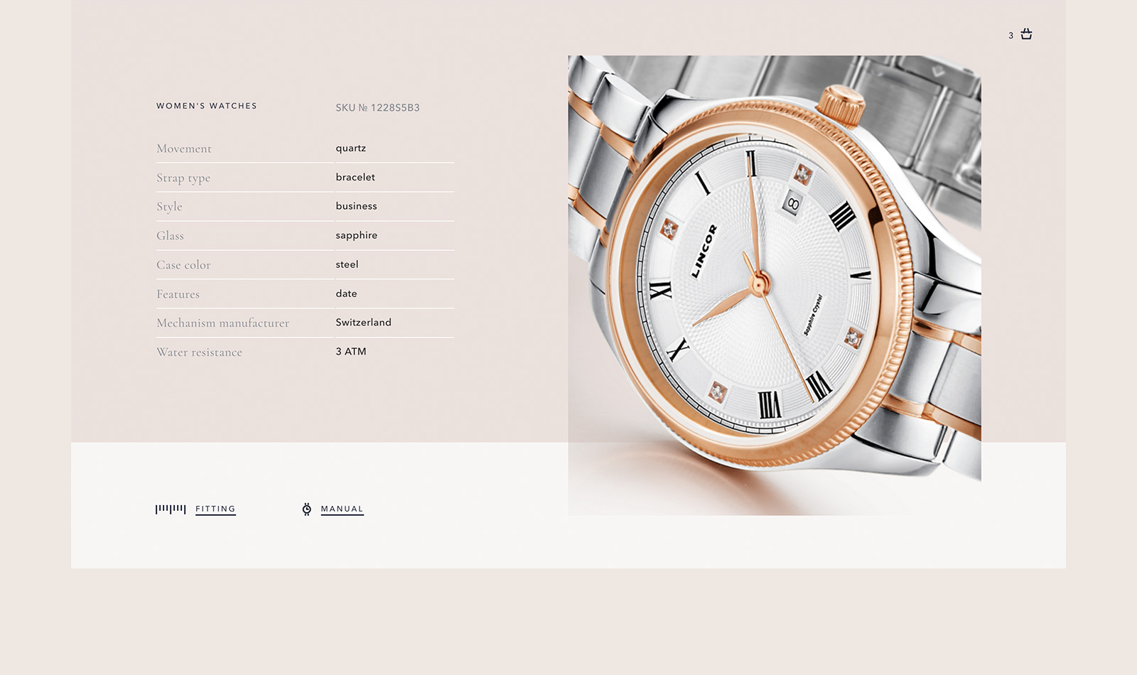
ECommerce design depends on the quantity of the goods to be displayed. In this case of a mono-brand website with a limited number of collections, we have opted for a wide grid with a good view of each watch. Every collection is of no more than a dozen items: one-off demonstration in good quality causes the emotional value of a product to rise.
If there are no items within a certain parameter, the parameter will not be displayed on the website in the first place.
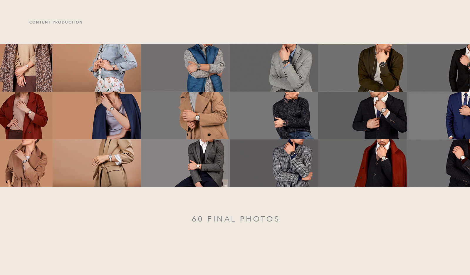
Look book art direction
We’ve executed a two-day professional photo shooting involving stylists and makeup artists directed by us: picking up the best looks, choosing the fabrics and cuts. The website has only classy pictures where people look exactly as they do in real life: it was important to choose the clothes for the situations to wear the watches in — exquisite, but close to reality.
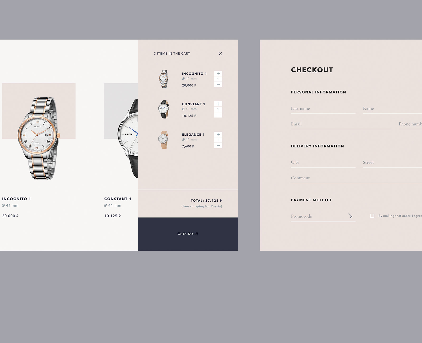
Shopping cart
Cart icon and number of items in it are displayed on every page of the site. The preview of the purchase is shown by a single click on the cart with no transition to another page. A watch can be added or removed from the cart from any given place on the site.
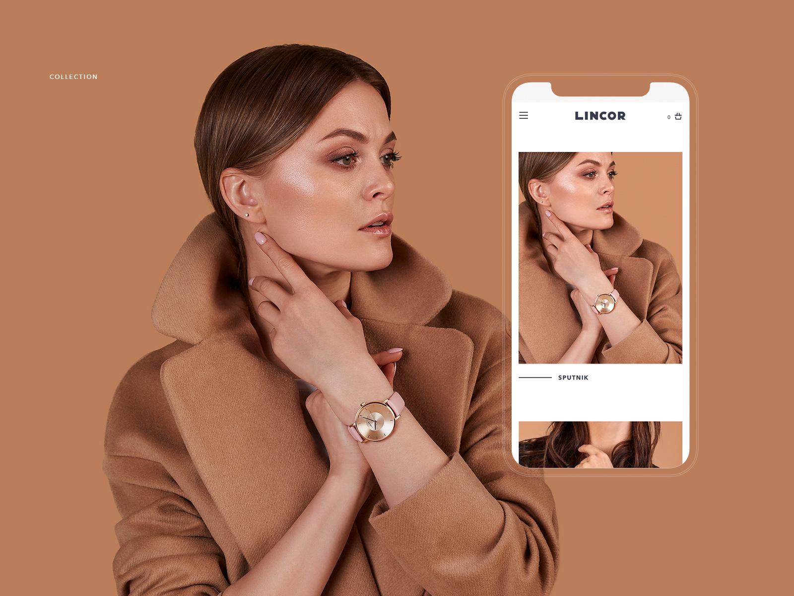
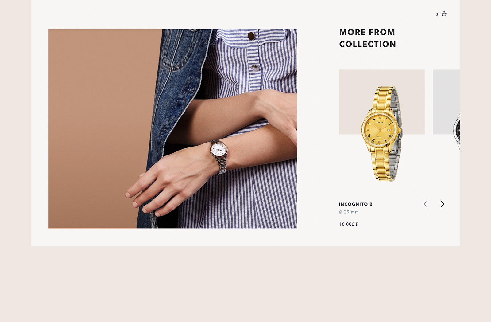
Real-life photos
Every flypage, besides the product shots, has a picture of the watch being worn. Users see something more than just an impersonal item on a stand, each page is provided with an emotional photo featuring a real person.
We’ve conducted artistic direction of the lookbook photo shooting by picking up the looks and composing guidelines for the photographer.
Page transition speed
It is implied that an eCommerce website has many items to sell, which results in a great number of web pages. Page transitions on Lincor are implemented through ajax and web components. The header, footer, pop-ups, and cart remain unchanged: the project uses the single page application concept, so the only thing that changes with every hit is the page contents, this way the loading and display speeds go up.
There is a feature that allows setting up a promo code discount system. The client can assign the bonus amount through the content management system.
The cart does not reset when you close the page
It is a good practice to keep the chosen item in the cart after the website has been closed, even if the user didn’t sign in. It is natural for users to leave, give it a thought, decide whether they need the product and then consciously come back to make the purchase. We keep the personal data in localStorage of the user’s device, which means no chosen item gets lost.
Mobile experience on smartphones and tablets keeps all of the e-commerce functions and fine design.
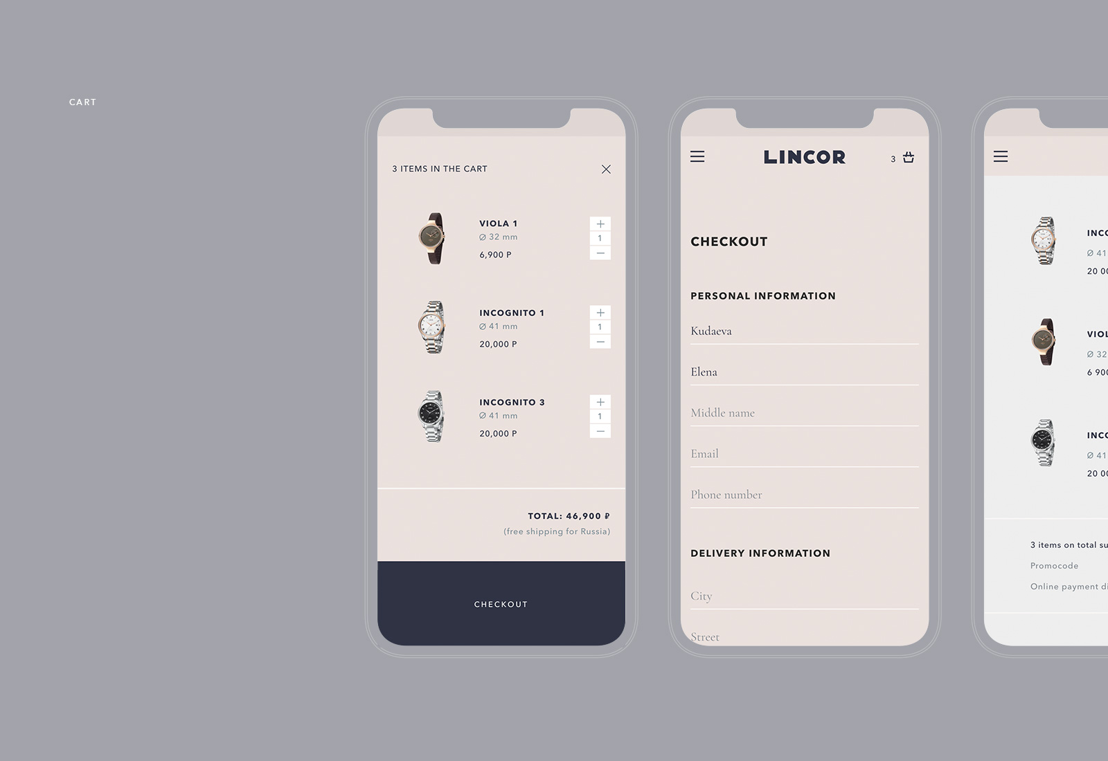
Handy autofill in the checkout form
We’ve made the final step of the purchase pathway as easy for users as possible: autofill is enabled through the integration with a huge DaData database. For instance, after getting the name of your town, the form will suggest the name of the street based on just a couple of its first letters. The database also uses mail services and will fetch your zipcode automatically.
Plans for the future
We’ve made allowance for the possible functionality extension in the future: currently, the website works with Yandex.Checkout payments, while other payment systems may be implemented if needed. Integration of API and Mailgun mailing service is already in place, and integration with a delivery service is in order.
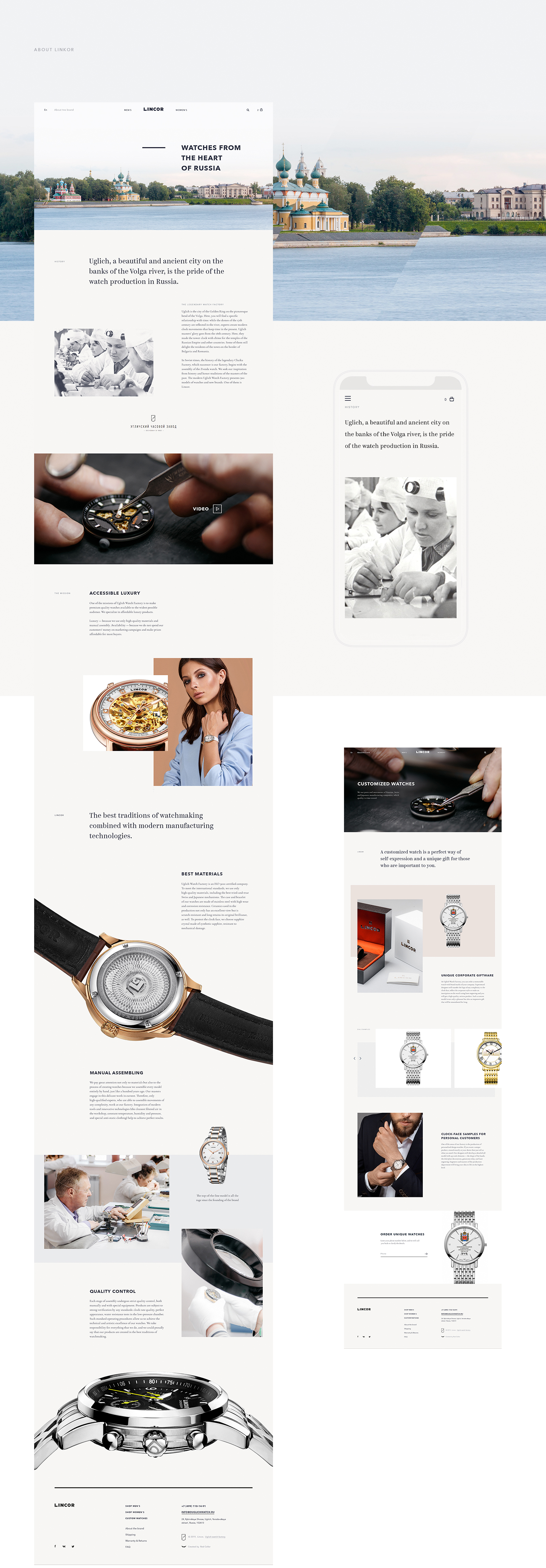

We’ve highlighted the brand’s history and created the feel of both manufacture and individual handcraft for each item.
next project
Autonomy


