Sally
Before we start
Sally is a company based in New York. They offer vehicles for rent to professional drivers working at Uber, Lyft, Via and Juno.
More than just a car rent
task
To tell the drivers about the offer and the benefits of working with this company, to create an image of a modern service that cares about its clients and its cars. To convey the character of the brand through the design that would differentiate it from business rivals.
Idea
To show a website through the driver’s perspective; while using the site, the client already feels like they are driving, so they will want to leave having a car picked for their needs. We’ve created a 3D model of a car that feels like it’s moving.
The 3D model
As the company doesn’t sell cars but offers services, we didn’t need to use detailed pictures on the site. So we worked out a three-dimensional image, a low poly model that looks like a real car and loads fast on any device.
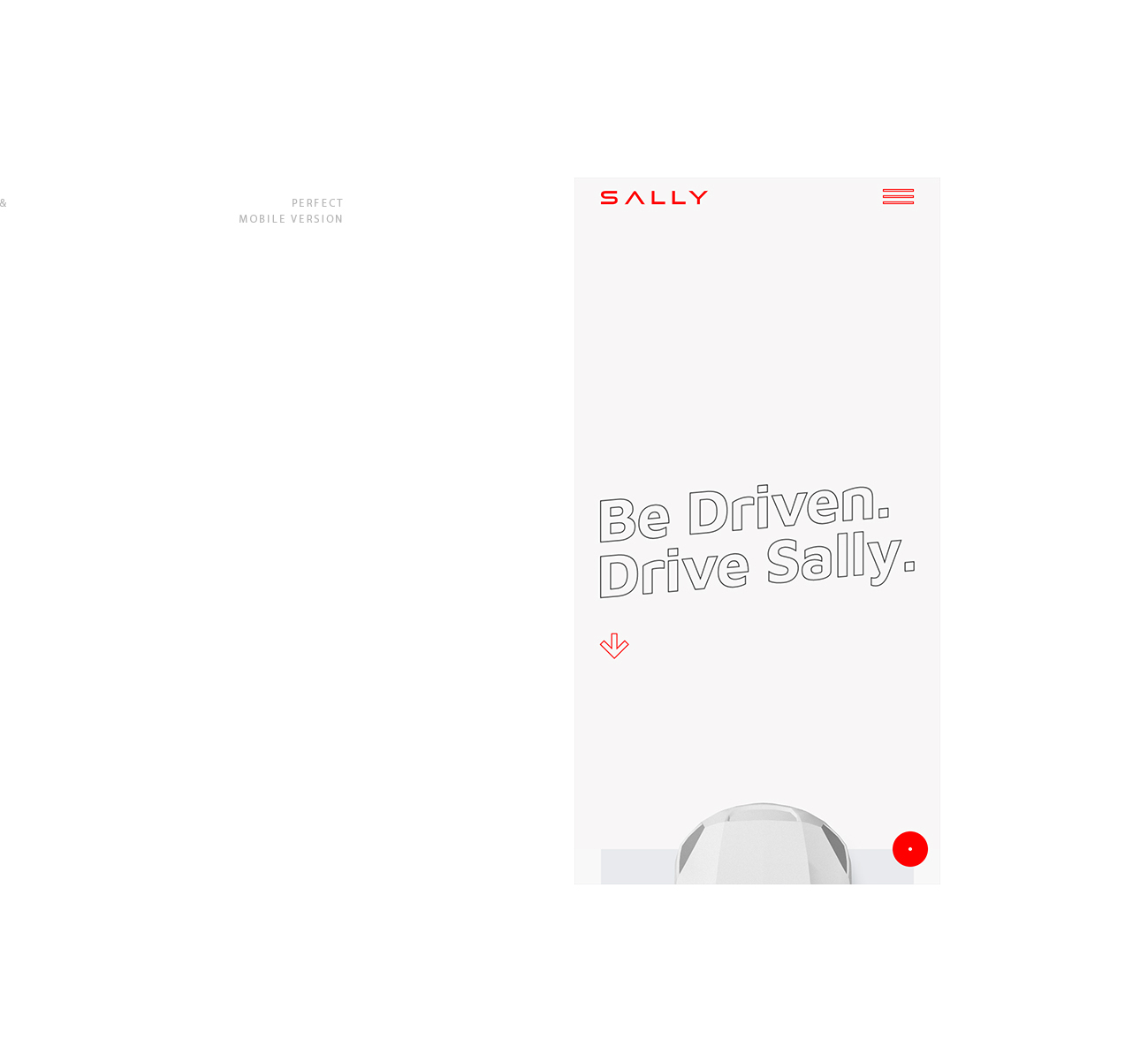
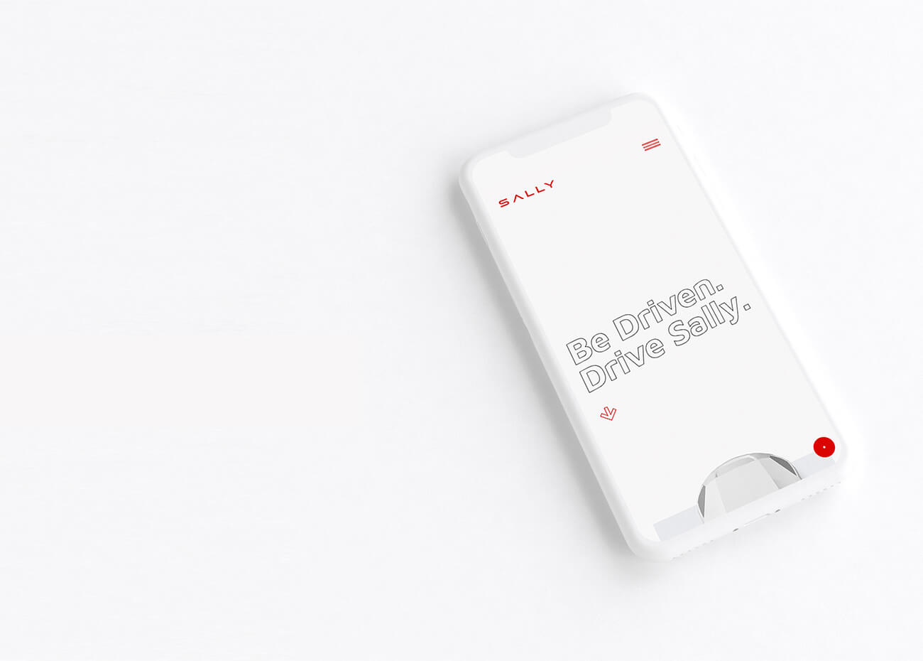
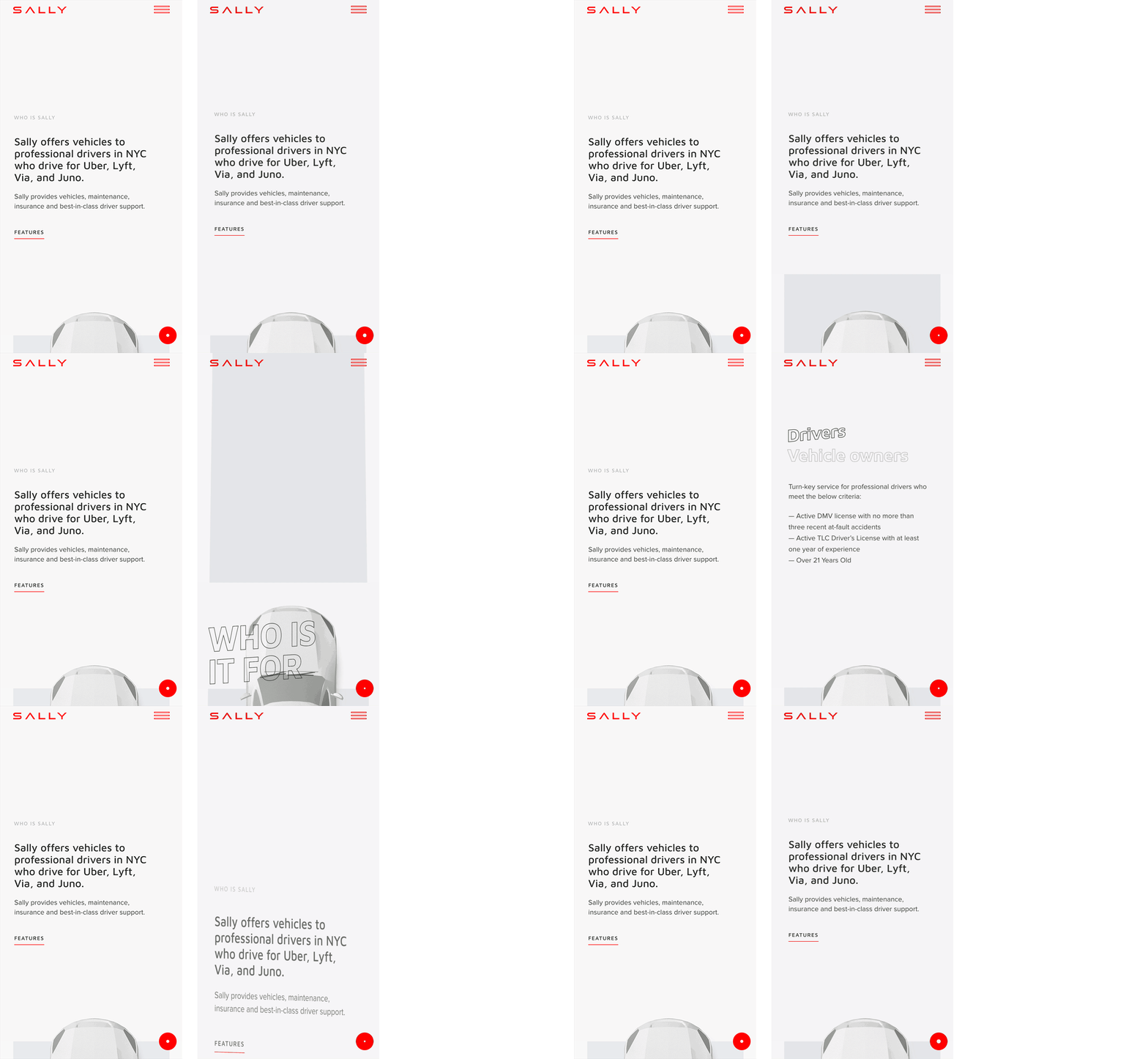
We've developed over 70 animations: the car feels real when you're scrolling, going from selection to selection or move the cursor.
For those on the move
Drivers often need to look something up using a tablet or a smartphone when they are on the go. We tested many screen resolutions so that all the elements and animations would be saved and the website would load fast on most of the out-of-date smartphone models.
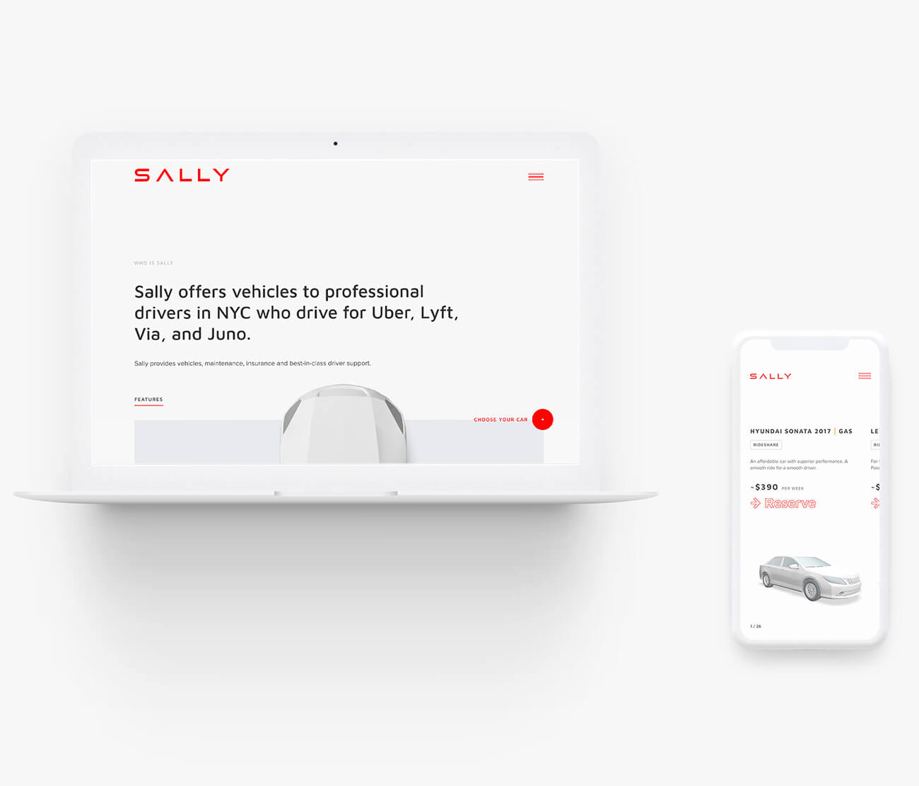
One click away from the reservation
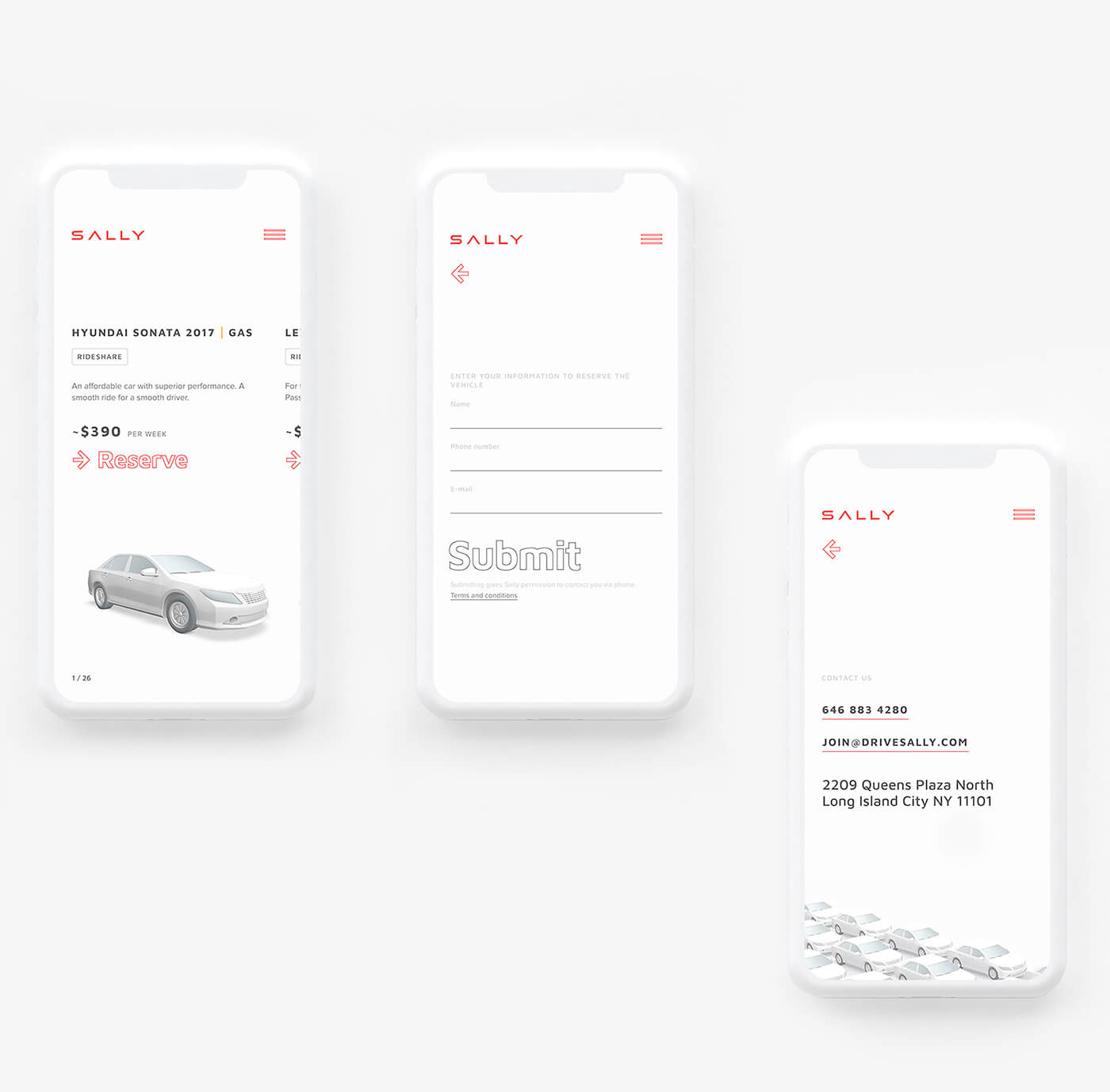
It is easy to access the car reservation page. The choice button is already present on the home screen and after submitting the form user is instantly presented with the cars available for the rent.
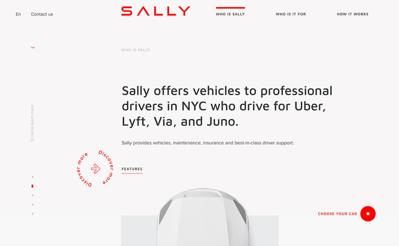

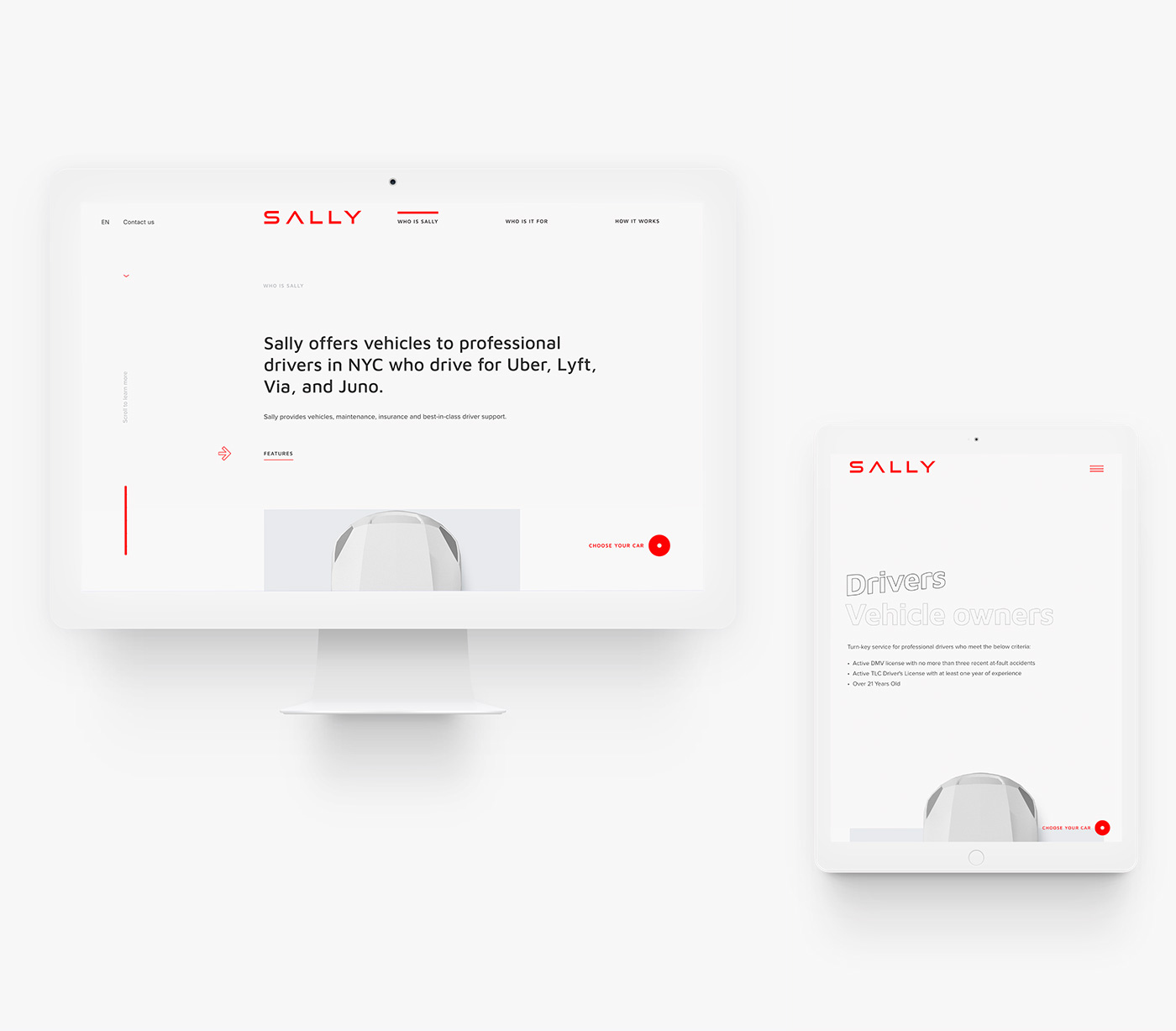
For the sake of good usability, we ensured there are four ways of navigation: menu buttons, scroll, tab&arrows, and dragging.


Details with an attitude
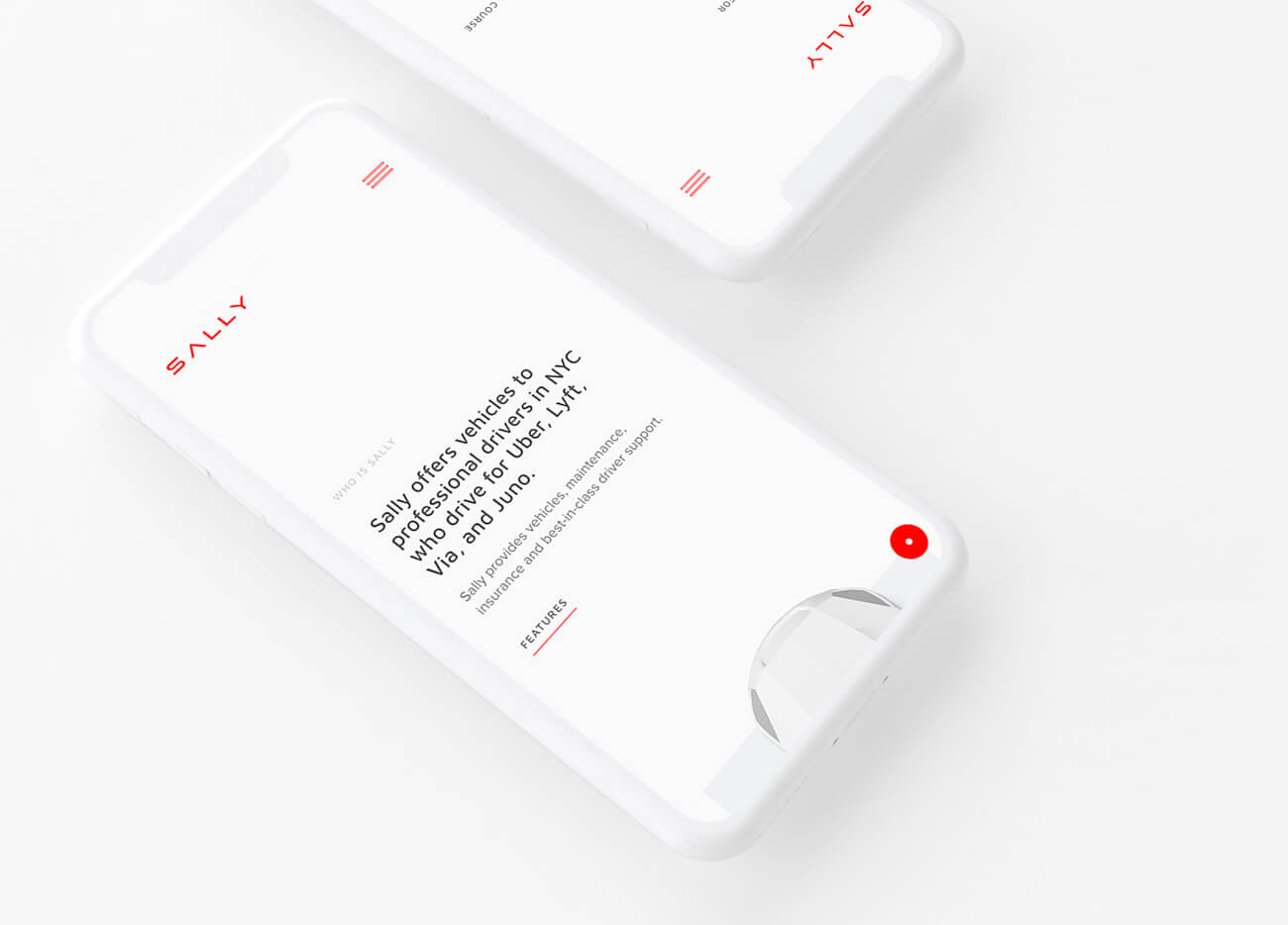
Headers are what users see first, and they, like many other details, influence the way a brand is perceived. We’ve picked a typeface that marries well with the corporate one and shows the spirit of the company which has a dynamic and friendly face.
Call-to-action button to choose a car: easy for the client, useful for the business.
It’s easy to make the first step
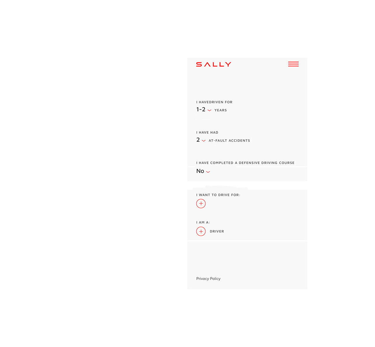
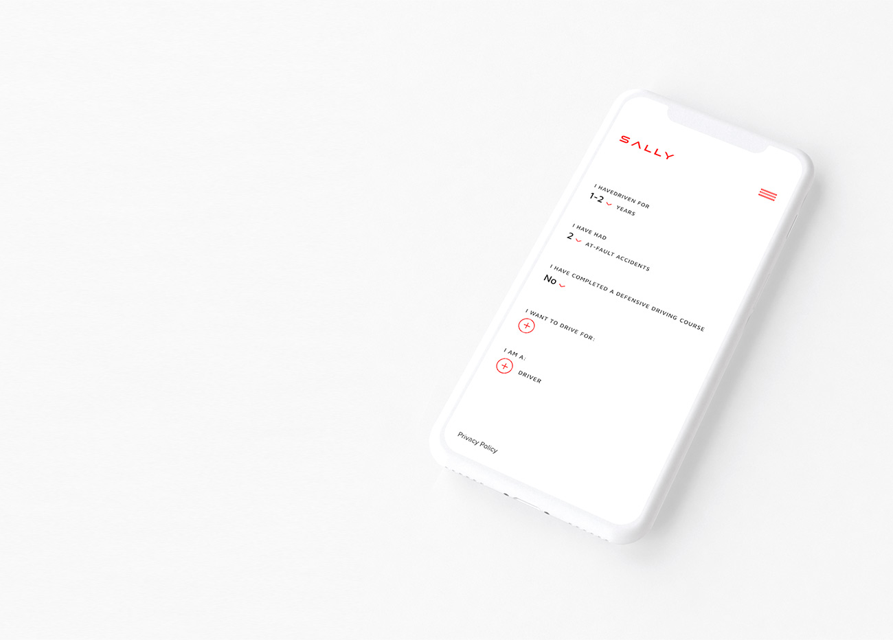
At the /form page with a questionnaire users don’t just fill in the blanks but they see a text speaking of themselves — they just need to choose options out of the offered ones. That is how we avoid the fear of blank paper.
Ready-made offer
The questions that users are asked before they can choose a car help to automatically categorize the drivers: their experience, number of at-fault accidents, completion of a defensive driving course — all of these things influence the cost of the rent and the types of cars available.


next project
Lincor


